Long and Short termed market Outlook
--------------------------------------------------------------------------------------------
The piece below is from Valuetrend Blog by Keith Richards, a Canadian technical analyst who founded the investment firm, ValueTrend Wealth Management.
---------------------------------------------------------------------------------------------
Today, I’d like to take a look at a few factors that will influence the long termed market trend, and the neartermed market patterns. I think you’ll find these observations valuable.
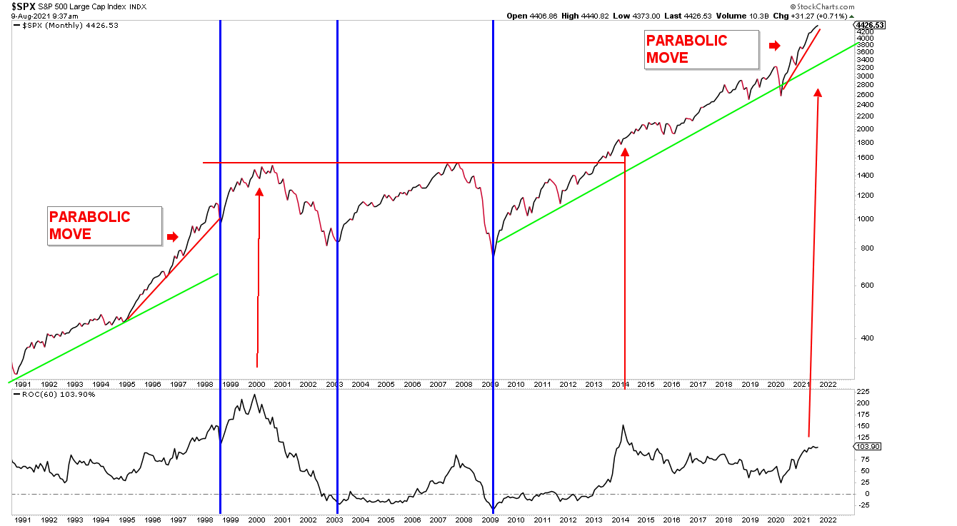
The long termed view
Our first chart is a long termed (monthly bars) view of the SPX going back to 1990. On the left side of the chart, I’ve notated the parabolic move by the market leading into the 2000/2001 peak. The SPX went parabolic (arched off of its trendline) in the late 1990’s as the technology sector became the only game in town. Note the long termed trendline (green) followed by the explosion in tech stocks beginning in 1995. My red trendline illustrates a parabolic move off of that green trendline. Below the chart is a 5-year Rate Of Change (ROC) indicator. My red arrow illustrates the market peak coinciding with the peak in the ROC indicator. Note that the parabolic move lasted some 5 years before peaking, leading into a market crash. The 2008 crash occurred after a test of the old highs of 2001 – also signified by a peak in the ROC (albeit not a high). I didn’t draw a read arrow on the chart, but its pretty easy to see. Note that the bottom/troughs of these two market crashes (blue vertical lines) occurred in a much shorter timeframe – just 2 or so years after the peaks. This is typical – markets take the stairs up, and elevator down, as is said.
Note on the chart that the third peak on ROC occurred in 2014. This peak did not lead into a major crash. Instead, it lead into a sideways period over the summer followed by a relatively small correction in 2015. For those who remember – that correction was lead by a move down in the commodity space – particularly oil. Whatever the case – the market excess was corrected in each of these situations. Two by crashes, one by a sideways volatile environment.
You will note that the current market is illustrating a similar parabolic pattern to that of 1995- 2000. ROC is rising, but- it does appear to be rounding over a bit. Keep in mind that the 1995-2000 parabolic pattern maintained itself for 5 years. The recent parabolic move began in 2020 – so its early yet.
The neartermed view
Below is another chart of the SPX, this time highlighting various Fed stimulation packages since the 2008 crash. Quantitative easing (QE), bond market manipulation (“twisting”), bailouts, easy credit, and now – HUGE record setting stimulation spending! The economy need not “take care of itself”. Nope, governments have introduced a new drug to markets and the economy. And an addiction has been formed. Hey, no worries – says the your friendly neighborhood government. We’ll let future generations worry about the consequences. Eat, drink, be merry. Here in Barrie, Ontario, we have a drug addiction crises. They get their fix, and come back for more. They worry little about their future. The Fed has provided the supply that the economic addicts crave.
Clearly, the massive bailouts introduced in 2020 after the COVID crises have lead into a larger than ever parabolic move (note the chart angle on the right) that Trumps all others. Bidening our time, we await future consequences. As investors, we need a backup plan. Justin case. The pattern is clear. Note how markets rose after stimulation patterns began. But…. Note how they either retreated or formed highly volatile patterns upon rate hikes or the end of QE packages.
If you want the know when the current parabolic market will end, the chart below holds the answer.

Our final chart is a closer look (weekly bars) at the SPX. We’re still below the overbought signal that I rely on for signaling market pullbacks. When the SPX is 10% over its 200 day (40 week) SMA, it is overbought. When that level gets to 15% it is highly likely to correct. Currently the SPX sits about 10% over its 200 day SMA. This implies an overbought, albeit not overly aggressive, market. Of more significance is the early signs of divergence by momentum indicators below the price charts. That is, when the SPX makes new highs, but the momentum indicators do not – it implies that momentum is not supporting future returns. Given these observations, along with the statistics revolving around August and September seasonality, and the upcoming Fed meeting market patterns discussed here, I am inclined to suggest that there is cause for some near-termed volatility.

Conclusion
The big picture is clear. So long as the Fed keeps the market supplied with its favorite drugs, markets will continue to rise. Damn the torpedo’s, full speed ahead. Markets have illustrated an ability to rise in parabolic patterns for several years before a bear market ensues. The reason for that bear market eventuality (notice that I did not say “possibility”) will come from the Fed. Technical indicators illustrating overbought patterns, and sentiment indicators illustrating investor irrationality will offer a near-termed timing edge. But the big picture will be driven by the Fed – as it has been since 2008.
-----------------------------------------------------------------------------------------------
From Valuetrend Blog by Keith Richards
ValueTrend Wealth Management
Source
https://www.valuetrend.ca/
No comments:
Post a Comment