Search This Blog

Thursday, July 28, 2022

Is The Fed Getting Ready To Rip Off The Band-Aid?

Is The Fed Getting Ready To Rip Off The Band-Aid?

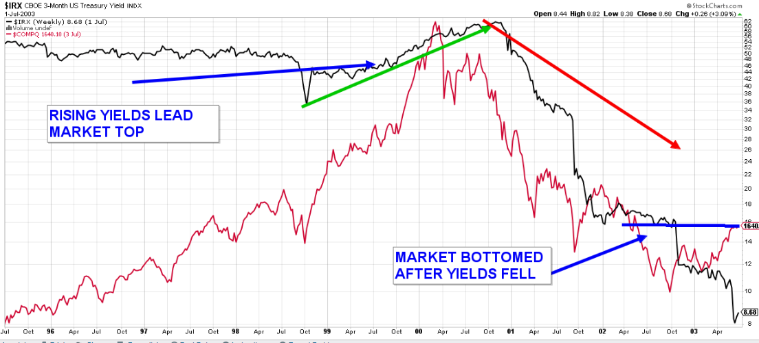
Today, the frictional buzz is now all about inflation and recession. It feels quite strange that the Fed would be raising interest rates as the economy is supposedly racing into the jaws of a recession. As I often like to say, “I hear what you are saying, but what is the money saying?” To this, I simply go to the 10-year Treasury. The rate on the 10-year has been falling consistently from mid-June (when it was over 3.5%) to now, at a low of just under 2.8%. If inflation and overzealous growth were really an issue, the rate on the 10-year would not be falling and the prices of oil and some foodstuffs are supporting this economic slowdown.

I hear the talk about inflation and how it’s a big problem for the stock market. Don’t look now, but the interest rates are singing a different tune. As of last week, the rate of upward EPS estimates revisions for the S&P 500 has been sitting around 37%. This is a pretty important number as it tends to bottom at 10-30% during times of economic slowdown. So, it is looking like we are pretty much there. Investors appear to have been wanting companies to simply rip off the Band-Aid when it comes to lowering 2022 and 2023 earnings guidance and outlooks. But we may be facing a situation in which the Band-Aid is pulled off more slowly and not completely removed until later this year.

With earnings season underway, in addition to following beats, misses, and growth rates as second quarter reports stream in, we are also assessing the potential future path of earnings. That’s super tricky right now given the uncertainty. Some expect steady growth in earnings for the foreseeable future while others are expecting a significant decline into 2023. Given the amount of technology used in all phases of business, along with the supply chain issues that have already been clearly discounted in stock prices, I believe that the revenue environment and corporate productivity are in too good of shape for earnings to contract anytime soon.

History shows that it takes a pretty rough economic environment to knock earnings meaningfully off track. Even during the most recent shock from the virtual shutdown of the world during COVID, earnings dipped 13% before the quick snapback and the markets had already recovered before these earnings snapbacks were even reported. Again, remember, that the market is a discounting mechanism. The pullback we have experienced is not from cracks in the structure but rather a pullback from the quickest doubling of the markets ever seen in history and bleeding off of some of the sugar high from the massive amount of money thrown at our US consumers. 

In a bear case scenario, as can be seen above in March 2009 and April 2020, a 10-15% decline in earnings is a reasonable expectation. But our economic forecast still calls for no recession this year and a 50% chance next year. A soft landing will still be very difficult for the Fed to achieve, but it’s possible. And a recession could be very mild, resulting in a smaller hit to earnings.

We have had a -1.9% GDP for the first quarter of this year and we are expecting around -1.5% for the second quarter. This would normally constitute a recession given two back-to-back quarters of negative GDP, but we don’t believe that the slowing we are seeing is due to “normal” economic factors and for that reason, we believe more of a soft-landing would be the more appropriate expectation.

The markets have been in a painful decline for some time now; really since November of last year, so to expect investors to forget about this pain and just go “all in” would be a hard pill to swallow. At this point, the major indexes will need to show that they can correct this bounce move off the lows, come down, not go to lower lows and then rally once more to show that possibly the bear is ready for hibernation. It is too early to tell, but we will be sure to let you know when we see it in our weekly missives. I will leave you with the picture of the “Williams Panic Indicator” which shows that we are at the panic levels we have seen previously- panic levels from which the markets rallied up and out. Again, we won’t know that the panic indicator was accurate until there is more technical data showing that the tide has turned. But for now, earnings are coming in pretty good, and even big-cap technology companies that have preannounced negative expectations are beginning to show resiliency off of their lows.

As always, please feel free to call with any questions you may have. The whole Tower 68 team is here to address any questions or concerns you may have.

.-----------------------------------------------------------------

Source

https://www.tower68.com/blog/is-the-fed-getting-ready-to-rip-off-the-band-aid-1

Wednesday, July 27, 2022

'Panicky money': Investors move $10.4B out of Canadian mutual funds in June

'Panicky money': Investors move $10.4B out of Canadian mutual funds in June

Canadian mutual funds posted net redemptions of $10.4 billion in June as investors headed for the exits amid market volatility. That’s an acceleration from May, when a net $6.4 billion was pulled from mutual funds.

The latest data from The Investment Funds Institute of Canada (IFIC) showed investors pulled their money out of equity, bond, and balanced mutual funds last month, while money market funds saw a net inflow of $1.3 billion as investors opted to hide in safer haven assets.

“$10.4 billion in ‘panicky money’ flowed out the door,” Tiffany Woodfield, a portfolio manager at Raymond James’ SWAN Wealth Management, said in an email.

“Many people say ‘I am a long-term investor’ and then they check the news daily to make sure long term is still the way to go. History has proven time and time again that long-term investing is the way to go. The mutual fund and ETF data from June shows that some people are thinking short term.”

The mass redemptions came as volatility gripped the markets in June with no shortage of investor worries.

Rising interest rates, fears about a potential recession, persistently high inflation, and concerns about how corporate earnings will fare in the tough economic environment all hammered stocks.

IFIC reported Canadian mutual fund assets fell $107 billion, or 5.6 per cent, to $1.8 trillion as of the end of June compared to May.

“If a number of people are panicking and selling, then the mutual fund manager will need to sell companies and investments (all of which they like as investments) to free up cash for redemptions,” Woodfield said.

“This is no reflection on the portfolio manager’s ability to manage the mutual fund but does make it much more difficult. Also, in times like these, the manager is having to keep a higher percentage of cash than they would like to meet the redemptions.  This makes them unable to make purchases while the stocks they like are “cheap” and the cash that is simply sitting in the portfolio to meet redemptions causes a significant drag on the funds returns over time.”

Exchange-traded funds fared much better in the month, with net redemptions of $670 million in June, the data showed, with equity ETFs posting the biggest decline.

Total ETF assets fell $22 billion, or 7.1 per cent, to $288.9 billion in June from May.

IFIC survey data accounts for about 91 per cent of total mutual fund industry assets and is complemented by additional data from Investor Economics.

-------------------------------------------------
Source

https://www.bnnbloomberg.ca/panicky-money-investors-move-10-4b-out-of-canadian-mutual-funds-in-june-1.1797198

Friday, July 22, 2022

Whispers On Wall St... But Which Do You Listen To?

Whispers On Wall St... But Which Do You Listen To?

Last week looked like it was going to be another disaster of a week until it turned on a dime Thursday and was up strong on Friday. This week started out on the upside and then turned when Apple mentioned that it was going to reduce employee hiring. More and more, the markets are at a point where they react to seemingly every comment from leading companies in the US economy.

At the same time, the S&P 500 seems to be trying to put in a bottom and build a base from which to recover. The headline macro information and news headlines continue to incrementally impact the market as well. Among the noise, I continue to focus on the bigger picture issues that remain intact and give less attention to individual company issues. The current issues that remain front and center are:

  • Elevated levels of inflation
  • The Fed continues towards getting things under control from the perspective of spending, hiring, and wages
  • The US economy slowing its growth rate and showing continued signs of impending recession as measured by Q1 GDP declines, Q2 initial signs of continued GDP declines, and the inverted yield curve
  • Corporate profit expectations moving forward still show too high expectations. As the commentaries on Q2 earnings come in and are combined with comments regarding expectations moving forward into 2023, signs of cracks in the growth expectations are being confirmed across various industries

I continue to advise investors to spend less time agitating over the day-to-day wiggles and keep their eyes on where we are going, which my research says is that the S&P 500 is likely under pressure until max pessimism for earnings gets priced in and we can finally begin looking forward to a more constructive outlook. Since I must say that there is virtually nothing positive being espoused by the media, MSN"BS" and CN"BS" analysts, it is very much feeling like the majority of the negativity is baked into the cake at this point. This doesn't mean that the market pullback is over, but it is the beginning of what the Fed needs to see? If it is, they can stop raising interest rates, due to inflation, and too much free money on the sidelines post COVID. The last thing that they want is to go from being seen as the culprit for too much inflation and then directly into the orchestrator of directing the economy into the jaws of a recession!

What I find rather strange is that the big 75 basis point rate increase that was done in June clearly hasn't had a chance to have its impact on the economy and now there is rhetoric being bantered about for another 75 basis points to be added this coming week. Sort of feels to me like the Fed was a little late to the scene of the crime and now it are trying to make up for lost time and stand a chance of raising too much. If it does raise too much, it ultimately will be forced to possibly ease these rate increases into the end of the year if a recession appears imminent. I mean think about it; the too robust growth in 2021, Fed-induced slowdown to curb inflation in 2022, and then giving it gas again at the end of 2022- all in the biggest economy of the world!

In the end, the point that I feel needs to be remembered is that the stock market is a discounting mechanism. Fed Chairman Powell told us in the middle of 2021 that he was going to take away the punchbowl, and the market continued to move to all-time highs. Now, the market seems to have no hope, and this could be the negative commentaries needed to precede a market recovery. Also, the statistics of what markets do after two consecutive quarters of decline have really been quite undeniable.


The next picture that I find particularly interesting is the one that compares the yield on 10-year Treasuries to the NASDAQ 100 Index. If interest rates stop going up on the 10-year it tends to infer that there is a slowing impending in the economy. This tends to be particularly positive for large technology companies (NASDAQ 100) as they don't need strong economic growth to perform. Also, with stronger inflation numbers released last week and rates didn't rise could also infer that we are approaching a high in inflation readings- possibly this could have been the highest set of numbers. We see this resilience to a negative news cycle as a market positive, especially for the lagging NASDAQ 100. Don't take this to mean that the lows are necessarily in, but rather that the market bottom is likely to form sometime towards the latter half of the current quarter we are in. I don't mean this to say that it drops much more between now and then, but rather that a market bottom that isn't event-driven (like the COVID six-week bear market), tends to be a process rather than an event. 


The final question being asked by all is about the timing of the end of the decline and when we could expect that recovery. In terms of timing, we are watching for a base building as I have mentioned above. As far as timing, if the US Presidential cycle holds true as it has historically, the third quarter of this year should begin the building of a base, and this could lead to an upturn in the fourth quarter. It should be remembered though that major market lows have occurred in October more times than any other month since 1932! So take a moment and look at the larger chart below that has a red dotted line showing what we have experienced in 2022 thus far, overlaid on the Presidential Cycle chart. Also, I have inlaid the months of market lows chart on top of this. I think that since things are happening faster due to information technology a bottom could be in the process of being hammered out quicker, but historical facts I find to always be a valuable guide. 


In closing, it really must be remembered that we have been through these types of corrections many times before. They all feel different each time as we are all at different places in our lives each time. But the fact remains, the markets finish their negative season and rise once again. We don't expect this time to be any different.

------------------------------------------------

Source

https://www.tower68.com/blog/whispers-on-wall-st-but-which-do-you-listen-to

Tuesday, July 19, 2022

GE reveals identity of 3 companies after historic split

GE reveals identity of 3 companies after historic split

General Electric on Monday revealed the names of the three companies that will operate on their own after the historic split of the one-time conglomerate, including a mashup of words that will make up the name of the new energy company.

GE announced in November that it planned to split into three companies focused on aviation, health care and energy.

The name of the aviation business that will essentially be the remaining core of GE, headed by CEO Larry Culp, will be called GE Aerospace.

The energy wing, including GE Renewable Energy, GE Power, GE Digital, and GE Energy Financial Services, will be called GE Vernova.

"The new name is a combination of ‘ver,' derived from ‘verde’ and ‘verdant’ to signal the greens and blues of the Earth, and ‘nova,' from the Latin ‘novus,' or ‘new,’ reflecting a new and innovative era of lower carbon energy that GE Vernova will help deliver," the company said Monday.

The healthcare business will be named GE Healthcare.

The split is the culmination of years of paring by the massive American conglomerate which signaled a shift away from a corporate structure that dominated U.S. business for decades.

The company has already rid itself of the products most Americans know it for, including its appliances, and in 2020, the light bulbs that GE had been making since the late 19th century when the company was founded.

The breakup marks the apogee of those efforts, divvying up an empire created in the 1980s under Jack Welch, one of America’s first CEO “superstars.”

The company said Monday that GE HealthCare will be listed on the Nasdaq under the ticker symbol “GEHC.” GE plans a tax-free spin-off of the business early next year.

GE Vernova is exected to be spun off in early 2024. Once the spinoffs are complete, GE will be an aviation-focused company that will own the GE trademark and provide long-term licenses to the other companies.

-----------------------------------------------------
Source

https://www.barchart.com/story/news/9196064/ge-reveals-identity-of-3-companies-after-historic-split

Monday, July 18, 2022

Financial Websites I Use

Financial Websites I Use

-----------------------------------------------------

https://stockcharts.com/freecharts/marketsummary.html

https://www.dataroma.com/m/home.php

https://www.holdingschannel.com/

https://www.morningstar.com/

http://thezenofinvesting.com/upcoming-spinoffs/

https://www.barchart.com/ca

https://www.sedar.com/

https://www.valuetrend.ca/author/sm0r4alueund/

https://www.tower68.com/blog

https://www.tmx.com/

https://www.td.com/ca/en/investing

https://www.oaktreecapital.com/insights/memos

https://www.barrons.com/market-data/market-lab/beta

-------------------------------------------------

Friday, July 15, 2022

Comparing past bears helps future gains

Comparing past bears helps future gains

An interesting post from Keith Richard's ValueTrend...A blog which focuses on technical analysis

----------------------------------------------------------------

Today, we will take a look at the 3 most recent bear markets – including the current bear. I’ll start off with a comparison of the velocity, magnitude and duration of each of the three bears. All three bears resemble each other in their classic “focused breadth” characteristics going into the peaks. 2001 was lead by a technology bubble, 2008 was lead by a real estate (and subsequent financial sector) bubble along with an oil bubble, and the recent bear was lead by a technology bubble and potential commodity bubble. I’ll mostly focus on the comparisons of today vs. the 2001, due to the technology bubble similarities coming into both of these market peaks. Lets get at it.

A tale of 3 bear markets

The chart below is that of the NASDAQ Composite Index. I’m not posting the SPX chart because, after this quick review of the velocity, magnitude and duration of the 3 bears – I will be focusing on the similarities between 2000/2001 and the current market. That is, the commonality of a narrow market lead by tech and growth stocks.

Interesting: Despite the fact that the NASDAQ is less focused on financials and energy than the SPX, it was still affected quite substantially in 2008 as the “sell everything, prepare for financial collapse” mindset set in. This, as broad markets are selling off more than just the tech/growth sectors in today’s “sell everything” markets.

Anyhow – todays bear is not likely over, were it to mimic to the past two length’s and peak-to-trough maximums.


Tech bubble version 2.0

OK – lets get into the “2000/2001 vs. now” debate. Are these periods mirroring each other? Will the tech stocks take the same beating as they did in 2001? Before I get to some fundamental points, I owe the fine folks at Raymond James the inspiration for this blog. Specifically Eve Zhou and Nadeem Kassam, two brainy research analysts who published a paper entitled “Dot Com Bubble – a Tale of Two Time Frames”. Again,  lets look at the NAZ – which is NOT a pure technology index, but tends to represent tech and growth positions with a heavy emphasis on technology. Since the last bear market bottom in March 2009. As you can see, the NAZ is about to test its trendline. Will it hold and bounce? Will it move sideways for a while? Or will it break, and follow the same path of gut wrenching losses last seen in 2001?

Some thoughts:

  • In 2000, the drawdown (per top chart) was near 80%. The current drawdown is less than half of that. This might imply much more downside to go, if we strictly focus on history.
  • However, the selloff of late has been more rapid than that of the 2000 crash. As you may know – I discussed parabolic moves in my Online Course. The market always reverses moves that become parabolically oversold or overbought. The recent steep decline might suggest the length of time (so far only 8 months) will be a fraction of the 3 year contraction in the “dot com” era. As such, it may not be so deep either.
  • The “dot com” crash of 2000 was capped by the 9-11 terrorist attacks in the USA. You can see that the market looked like it was attempting a reversal during the summer of 2001. That might have been the end of the technology selloff, had it not been for the terrorist attacks a few months later.


Rising rates aren’t that great

Clearly, interest rates and monetary policy drive markets in general, and the growth sectors such as technology all the more so. Here’s a chart of the 3 month treasury yield vs the NASDAQ since 2017. Falling yields inspired a rally when COVID hit the scene in 2020. Now, rising rates have put the kibosh to the NAZ.

Below is a current chart illustrating the recent rise in rates (3 month treasury yield, black line) vs. the NASDAQ (red line). This is (IMO) a path that is likely going to push NA economies into recession. There there is the “flight to safety” from the Euro and other currencies, alongside the rising rates, that will eventually provide an excuse to give the Fed enough cover to drop more hints of a September pause.

When and if rates stop rising, then begin to ease, watch for a technology and NASDAQ setup and eventual reversal. 

Here’s the 3 month treasury yield before the NASDAQ crash in 2000/2001. Same pattern. Markets (NAZ) bottomed as rates declined.


Dropping a few F-bombs

Other similarities between the 2000 dot-com bubble/bear and the current bubble/bear. I am drawing from the fundamental (say it isn’t so–fundamental?) research report of our friends over at RJ noted above:

  • In both market bubble periods leading to the bear corrections, NA economies were strongly growing above trend levels
  • In both bubble periods we saw unemployment levels fall to near record lows
  • In both bubble periods ending patterns we saw (and are seeing now) declining consumer sentiment
  • In the dot-com bubble, unemployment levels rose sharply off of the above noted record-lows. RJ notes that there are currently tell-tale early signs of rising unemployment. They expect tighter rate policies to eventually push the economy into contraction, resulting in job losses or layoffs.
  • Dot-com peak PE ratio was 52 for the tech index. Prices/earnings collapsed and things settled to 18 by the time the bear was over. The current bubble saw a PE of 28 in the tech index, and are currently near 19. In other words, the peak PE in 2000 was about double of the 2021 peak.
  • An earnings contraction should not be as extreme as in the dot-com era due to the fact that the tech leaders of today are of higher quality profitable businesses. Compared to the (pardon the slang) garbage that was being bid up in the dot-com era. Profit margins of the current tech index gap the dot-com era index by 12.5%. That’s substantial.
  • My personal memories of Nortel, Juniper Networks, Global Crossings left a lifelong bitter taste in my mouth towards crowd stupidity (recent reenacted with marijuana and bitcoin).  No matter how ridiculous the valuations got on Netflix, Amazon, Tesla or Google – they  are firms with viable business models. True, both eras had disappearing stock acts – but there were far more of them in 2000.

Bottom line

So long as rates are rising AND the Fed/BOC make no insinuations of an end of them in sight – the tech sector and other growth stocks represented by the NASDAQ are living in a world of pain.

But, my forward-view, as I have mentioned a few times in the past few weeks:  The Fed/BOC may, sooner than you may think, talk towards less aggressive tightening, and ultimately easing. My guess (and its just a guess) is that we will see some of that Fed-speak begin in the fall – perhaps September.  See my comments about the dollar, etc. From there, we need to witness a reduction if not outright reversal in policy to witness an eventual opportunistic trade in a number of high quality technology and growth stocks. Perhaps, as it did in 2000, the market will need a period of falling rates before reversing. Or, perhaps (things move quicker these days) we will see the market reverse in the very early stages of monetary easing. I’m inclined to think we will see an early stage revesal as described in my “Opportunity” blog. But, the charts will ultimately tell us when to buy.

Consider this a lesson in history to profit in the future.

One last thing: I just recorded a video on Point & Figure charting. Hopefully it will be out this week. Many of you may find that learning the basics of this unique trend following methodology will be helpful in your own analysis. Keep an eye open for the video. Or, subscribe here to have automated notices sent to your email inbox whenever a video is posted.

-----------------------------------------------------------
Source

https://www.valuetrend.ca/comparing-past-bears-helps-future-gains/

Tuesday, July 12, 2022

10 market observations you should be aware of

10 market observations you should be aware of

A useful reminder from Keith Richard's Valuetrend...A blog about technical analysis

---------------------------------------------------------------

Bob Farrell, one of the pioneers of technical analysis, worked at Merrill Lynch for over 45 years. He died at age 86 in 2021, but he remains quoted as an icon in the field. Today, I revisit his famous “Ten Market Rules to Remember”, and apply them to current charts. I found that, no surprise, Mr. Farrell’s rules are as relevant today as when he retired from Merrill Lynch 20 years ago. Well, most of them (see rule #4). Read on for this great man’s words of wisdom, and my humble interpretation in today’s markets!

Rule1: Markets tend to return to the mean over time

The long termed view of the SPX shows us that the “mean” average (purple dashed line) is still below price. The trend channel outlines the extremes of the SPX since 1920. Bob’s rule of markets returning to the mean (purple line) over time, and often running along that line, would have predicted the current bear market as an inevitability. The chart suggests more downside to go before the mean line is reached.


Rule 2: Excesses in one direction will lead to an opposite excess in the other direction

Excess in one direction, often called “parabolic moves”,  is often identified by momentum indicators such as RSI, Stochastics, ROC etc. Another view is to look for an aggressive move off of any established trendline. Such a move is often reversed. Parabolic moves can also be identified by my personal rule (hopefully I will be remembered by a few contributions to TA, this being one of them) of price’s relationship to the 200 day Simple Moving Average. That is, a move of more than 10% over or below the SMA means things will inevitably reverse. The greater the % over, or under 10% off the 200 day SMA, the more likely a reversal.

Below is a chart with a 6- month (long termed) Rate of Change (ROC) in the bottom panel. I’ve drawn green lines to outline established trendlines. I noted in my Technical Analysis Course that such coinciding parabolic moves off of the trendline – coinciding with peaking ROC levels – usually indicate a pullback is coming. This is a chart I posted on the blog last winter – and it proved correct.


Rule 3: There are no new eras — excesses are never permanent

Bob’s rule #3 was another way of echoing the Great Sir John Templeton’s words:


I wrote a blog on May 16th comparing the current bear market to those of 2001 and 2008. Its worth reading if you haven’t. The patterns are so similar, its eerie. This time is not different. There is no new era. Ultimately, this cycle will fulfil its destiny (Star Wars fanatic here, gotta quote the Sith Lord once in a while). We will return to a bull trend – even if it doesn’t last as long as the recent run. If you understand that there is no new era, and this time isn’t different, you can trade the commonalities. Patterns repeat. Take advantage of them.

Rule 4: Exponential rapidly rising or falling markets usually go further than you think, but they do not correct by going sideways

Actually, gotta disagree with Bob on this one. Stocks and markets correct their excess (up or down) in many ways, including sideways consolidations. In fact, a reader just inspired me to re-write a blog on long termed sideways markets – something I have written about in my books, and on blogs several times over the past 20 years. Anyhow, sideways moves often correct excess movements on markets and stocks. Here is only one example (AMZN). Note the parabolic moves just prior to the sideways periods. Interestingly, we’ve just seen a parabolic downside move on the stock. It looks like its setting up for another sideways consolidation, don’t you think? This might tie into my belief that when the current bear ends, it will be tech stocks that make the first move up.


Rule 5: The public buys the most at the top and the least at the bottom

Well, you KNOW I’m going to agree with this! As you know, I wrote the book on contrarian investing! Contrarian is my middle name.

Here’s the AAII bears-only index. The AAII is the public/ non professional investor. Red arrows show too few bears, a bad omen. Black arrows show too many bears, a good omen. Bearish near the bottoms, bullish at the tops. Just as Bob said. We’re in that “too bearish” zone now. But we need chart confirmation before we get too excited.


Rule 6: Fear and greed are stronger than long-term resolve

Yeah, that’s why this stuff happens to nice people who buy the SPX and other securities. Does anyone honestly think these big moves came from earnings revisions???


Rule 7: Markets are strongest when they are broad and weakest when they narrow to a handful of blue chip names

That’s called breadth. Below is the % of stocks in the SPX that were trading above their 50 day SMA’s. Notice how that percentage was falling in 2021 EVEN THOUGH THE SPX WAS RISING STEADILY !!! That’s because the market was rising on mainly one thing: growth stocks. Post COVID, stay inside, buy online, etc.  I blogged on that ALOT in 2021. As Bob said, that “handful” of rising stocks doing all the work just ain’t healthy.


Rule 8: Bear markets have three stages — sharp down — reflexive rebound — a drawn-out fundamental downtrend

That’d be yer’ basic Elliott Wave Pattern.

A is the first leg, B is the second leg, C is the final drawn-out leg.

Good news, we are likely in the final drawdown! Bad news. It isn’t over yet. Until the trend rectifies, that is.


Rule 9: When all the experts and forecasts agree – something else is going to happen

Absolutely agree with this one!

Lets look at two groups of experts. First: The NAAIM (National Association of Investment Managers) shows us what the investment experts are doing – by looking at their % exposure to the stock market (vs cash). They were heavily in cash as the market went down (a good thing) in 2008 – but stayed out and missed the bottom in 2009. They went to cash right at the moment of the 2011 summer correction. Bad timing. Same thing with the short termed 2015 correction, missing out on a buying opportunity.

To their credit, Investment Managers were heavily exposed to the market in Trump’s first year when he offered favorable market and business policies to drive the markets. And they had high exposure last year during the bull market. They played the recent bear by then reducing exposure as the market entered the bear. So they aren’t so wrong all the time.

Bob was likely talking about the media when he used the term “experts”. Media writers like to pretend they are experts. My view: If they were experts, they wouldn’t be writing articles for a fraction of the salary that an effective Investment Manager can make. So to me, these media people are the “experts” we want to watch for contrarian indications of market direction. They are the dumb-money in the “expert” classification.

Sentimentrader has done studies showing how headline news that’s very bullish or bearish coincides with market tops and bottoms respectively. Their website posts a “Daily News Sentiment Index”. This is a measure of economic sentiment based on computer analysis of economics-related news articles. The index constructs sentiment scores for economics-related news articles from 16 major U.S. newspapers compiled by the news aggregator service. Below, you will note that the headlines (low line) coincides nicely with major market bottoms, as I marked with boxes. Wrong, at the wrong time.

Of note – we are not at a “too bearish news headline” moment yet. Its getting there, but it would appear we are not yet at a coinciding market bottom/ bearish news setup. When we view this study, you can see why I prefer to use quantitative data, like this one, rather than hazard a guess that the news is “too bearish” or investors are “too pessimistic”. We need to know proven, tested, indicators that signal a probable market change.  The data on the chart below is one example of quantifying this process. Bob wouldn’t have had these tools for much of his career, but his concepts can be proven correct with modern data analysis.


Rule 10: Bull markets are more fun than bear markets

No guff, Bob. No guff.

----------------------------------------------------

Source

https://www.valuetrend.ca/10-market-observations-you-should-be-aware-of/