Comparing past bears helps future gains
An interesting post from Keith Richard's ValueTrend...A blog which focuses on technical analysis
----------------------------------------------------------------
Today, we will take a look at the 3 most recent bear markets – including the current bear. I’ll start off with a comparison of the velocity, magnitude and duration of each of the three bears. All three bears resemble each other in their classic “focused breadth” characteristics going into the peaks. 2001 was lead by a technology bubble, 2008 was lead by a real estate (and subsequent financial sector) bubble along with an oil bubble, and the recent bear was lead by a technology bubble and potential commodity bubble. I’ll mostly focus on the comparisons of today vs. the 2001, due to the technology bubble similarities coming into both of these market peaks. Lets get at it.
A tale of 3 bear markets
The chart below is that of the NASDAQ Composite Index. I’m not posting the SPX chart because, after this quick review of the velocity, magnitude and duration of the 3 bears – I will be focusing on the similarities between 2000/2001 and the current market. That is, the commonality of a narrow market lead by tech and growth stocks.
Interesting: Despite the fact that the NASDAQ is less focused on financials and energy than the SPX, it was still affected quite substantially in 2008 as the “sell everything, prepare for financial collapse” mindset set in. This, as broad markets are selling off more than just the tech/growth sectors in today’s “sell everything” markets.
Anyhow – todays bear is not likely over, were it to mimic to the past two length’s and peak-to-trough maximums.

Tech bubble version 2.0
OK – lets get into the “2000/2001 vs. now” debate. Are these periods mirroring each other? Will the tech stocks take the same beating as they did in 2001? Before I get to some fundamental points, I owe the fine folks at Raymond James the inspiration for this blog. Specifically Eve Zhou and Nadeem Kassam, two brainy research analysts who published a paper entitled “Dot Com Bubble – a Tale of Two Time Frames”. Again, lets look at the NAZ – which is NOT a pure technology index, but tends to represent tech and growth positions with a heavy emphasis on technology. Since the last bear market bottom in March 2009. As you can see, the NAZ is about to test its trendline. Will it hold and bounce? Will it move sideways for a while? Or will it break, and follow the same path of gut wrenching losses last seen in 2001?

Some thoughts:
- In 2000, the drawdown (per top chart) was near 80%. The current drawdown is less than half of that. This might imply much more downside to go, if we strictly focus on history.
- However, the selloff of late has been more rapid than that of the 2000 crash. As you may know – I discussed parabolic moves in my Online Course. The market always reverses moves that become parabolically oversold or overbought. The recent steep decline might suggest the length of time (so far only 8 months) will be a fraction of the 3 year contraction in the “dot com” era. As such, it may not be so deep either.
- The “dot com” crash of 2000 was capped by the 9-11 terrorist attacks in the USA. You can see that the market looked like it was attempting a reversal during the summer of 2001. That might have been the end of the technology selloff, had it not been for the terrorist attacks a few months later.
Rising rates aren’t that great
Clearly, interest rates and monetary policy drive markets in general, and the growth sectors such as technology all the more so. Here’s a chart of the 3 month treasury yield vs the NASDAQ since 2017. Falling yields inspired a rally when COVID hit the scene in 2020. Now, rising rates have put the kibosh to the NAZ.
Below is a current chart illustrating the recent rise in rates (3 month treasury yield, black line) vs. the NASDAQ (red line). This is (IMO) a path that is likely going to push NA economies into recession. There there is the “flight to safety” from the Euro and other currencies, alongside the rising rates, that will eventually provide an excuse to give the Fed enough cover to drop more hints of a September pause.
When and if rates stop rising, then begin to ease, watch for a technology and NASDAQ setup and eventual reversal.

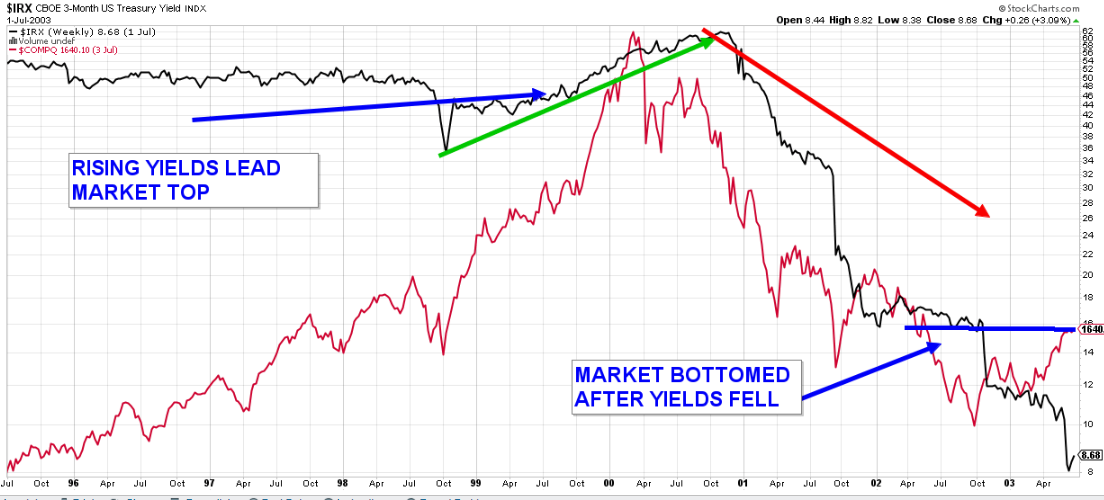
Here’s the 3 month treasury yield before the NASDAQ crash in 2000/2001. Same pattern. Markets (NAZ) bottomed as rates declined.
Dropping a few F-bombs
Other similarities between the 2000 dot-com bubble/bear and the current bubble/bear. I am drawing from the fundamental (say it isn’t so–fundamental?) research report of our friends over at RJ noted above:
- In both market bubble periods leading to the bear corrections, NA economies were strongly growing above trend levels
- In both bubble periods we saw unemployment levels fall to near record lows
- In both bubble periods ending patterns we saw (and are seeing now) declining consumer sentiment
- In the dot-com bubble, unemployment levels rose sharply off of the above noted record-lows. RJ notes that there are currently tell-tale early signs of rising unemployment. They expect tighter rate policies to eventually push the economy into contraction, resulting in job losses or layoffs.
- Dot-com peak PE ratio was 52 for the tech index. Prices/earnings collapsed and things settled to 18 by the time the bear was over. The current bubble saw a PE of 28 in the tech index, and are currently near 19. In other words, the peak PE in 2000 was about double of the 2021 peak.
- An earnings contraction should not be as extreme as in the dot-com era due to the fact that the tech leaders of today are of higher quality profitable businesses. Compared to the (pardon the slang) garbage that was being bid up in the dot-com era. Profit margins of the current tech index gap the dot-com era index by 12.5%. That’s substantial.
- My personal memories of Nortel, Juniper Networks, Global Crossings left a lifelong bitter taste in my mouth towards crowd stupidity (recent reenacted with marijuana and bitcoin). No matter how ridiculous the valuations got on Netflix, Amazon, Tesla or Google – they are firms with viable business models. True, both eras had disappearing stock acts – but there were far more of them in 2000.
Bottom line
So long as rates are rising AND the Fed/BOC make no insinuations of an end of them in sight – the tech sector and other growth stocks represented by the NASDAQ are living in a world of pain.
But, my forward-view, as I have mentioned a few times in the past few weeks: The Fed/BOC may, sooner than you may think, talk towards less aggressive tightening, and ultimately easing. My guess (and its just a guess) is that we will see some of that Fed-speak begin in the fall – perhaps September. See my comments about the dollar, etc. From there, we need to witness a reduction if not outright reversal in policy to witness an eventual opportunistic trade in a number of high quality technology and growth stocks. Perhaps, as it did in 2000, the market will need a period of falling rates before reversing. Or, perhaps (things move quicker these days) we will see the market reverse in the very early stages of monetary easing. I’m inclined to think we will see an early stage revesal as described in my “Opportunity” blog. But, the charts will ultimately tell us when to buy.
Consider this a lesson in history to profit in the future.
One last thing: I just recorded a video on Point & Figure charting. Hopefully it will be out this week. Many of you may find that learning the basics of this unique trend following methodology will be helpful in your own analysis. Keep an eye open for the video. Or, subscribe here to have automated notices sent to your email inbox whenever a video is posted.
No comments:
Post a Comment